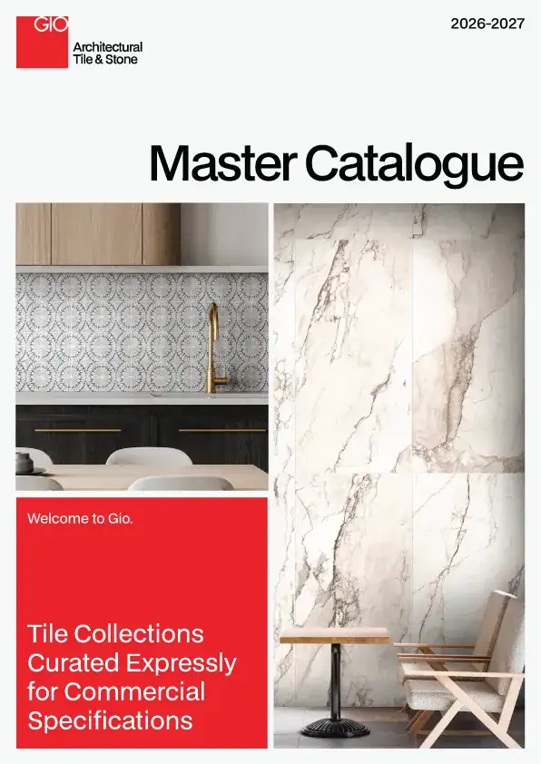
In commercial environments, finishes aren’t just background elements. They carry the brand’s identity and set expectations before anyone speaks. Tile plays a major role here because it balances design impact with long-term performance. When color, texture, scale, pattern, and material character are used intentionally, the surface becomes part of the brand message instead of just a backdrop.
Color Sets the Visual Message
Color delivers the first impression, and it does it fast. Warm neutrals project comfort and hospitality. Soft whites and greys feel clean, direct, and modern. Greens, blues, and other nature-influenced tones introduce a wellness sensibility. Deep charcoals create stronger contrast and a more elevated presence. A consistent palette helps the brand read clearly from the entry point through the rest of the space.

Texture Adds Dimension
Texture changes how a space feels. A matte stone look communicates a grounded, contemporary character. A lightly undulated gloss adds a crafted, expressive quality. Dimensional surfaces bring quiet depth and shadow. Texture is often the most effective tool for reinforcing the brand’s personality without introducing visual clutter.

Scale Shapes the Experience
The size and proportion of tile influence how a space behaves visually. Large formats create a smooth, modern flow and reduce visual breaks. Planks can stretch or widen a space. Elongated wall tiles introduce rhythm and a more tailored look. Designers often use scale to create hierarchy, define zones, or help guide movement, all of which support the brand’s overall intent.

Pattern Introduces Personality
Pattern makes the brand more expressive. Terrazzo adds energy and movement. Subtle stone veining offers a refined, natural feel. Geometric repeats or checkerboard configurations bring a graphic presence without overwhelming the environment. When used in the right doses, pattern becomes a memorable design touchpoint that supports the brand story.

Material Expression Reflects Brand Values
Tile that interprets natural materials carries built-in meaning. Marble looks communicate luxury and precision. Concrete visuals lean modern and urban. Limestone reads calm and hospitality-focused. Terracotta-inspired tones feel warm, creative, and human-centered. Material character helps designers align the visual environment with the values the brand wants to project.

Bringing It Together
Thoughtful tile selection is an easy way for designers to strengthen a brand from the inside out. When color, texture, scale, pattern, and material character all support the same narrative, the space reads clearly and consistently from one area to the next.
Every GIO commercial tile combines design-forward style with the performance commercial spaces demand. We understand how interior designers, architects, and specifiers think, and we’re here to help you choose surfaces that support a clear, consistent brand story. Connect with us when you’re ready to talk through options for your next project.