

Flat tile does its job. It covers a surface, holds a color, cleans easily, and stays out of the way. But increasingly, the wall itself is being asked to do more than just sit behind a room. In lobbies, reception areas, spa environments, restaurant interiors, and hospitality suites, designers are turning walls into architectural elements — surfaces that catch light, cast shadow, and shift in character as you move through the space.
That’s the work of dimensional tile. Scored planks, fluted profiles, sculpted ruvido textures, and natural stone splitface finishes all introduce genuine physical depth to a wall surface. These aren’t printed patterns or faux textures — they’re tiles engineered with real three-dimensional geometry that interacts with light the way carved stone or milled wood does, but in formats and materials rated for commercial installation.
The challenge for specifiers is that “3D tile” covers a wide range of profiles, each with different visual weight, light behavior, maintenance considerations, and best-use applications. Choosing the right one starts with understanding what each profile actually does on a wall — and they’re presented here from the most restrained to the most dramatic.
The Profiles: From Subtle to Statement
Scored Tile: Precision Lines, Controlled Rhythm
Scored tile is the most restrained of the dimensional profiles. Rather than pressing texture into the surface during manufacturing or cleaving stone along its grain, scored profiles are created by cutting precise, evenly spaced grooves into the face of a finished tile. The result is a clean, geometric linear pattern with sharper edges and more uniform depth than a pressed or molded profile.
The effect is closer to architectural millwork than stone carving. Scored lines create a tight, regular rhythm across the wall — almost like a slat or louver detail rendered in porcelain or stone. The shadow lines are crisp and consistent, giving the surface a graphic, contemporary quality that reads as designed rather than organic.
Where scored tile really earns its place is in the plank format. A narrow, elongated scored tile installed vertically produces a wall surface that resembles precision-milled wood paneling or metal cladding, but in a material that doesn’t burn, rot, corrode, or require refinishing. For commercial corridors, accent walls, column wraps, and any application where the design calls for linear texture with a modern, controlled character, scored planks deliver a look that’s hard to achieve any other way.
The practical advantages are straightforward: scored grooves are shallower and more uniform than other dimensional profiles, which makes them easier to clean and less prone to trapping debris. The geometric precision of the score lines means alignment during installation is more forgiving than organic textures where any misregistration breaks the pattern.

Fluted Tile: Concave Grooves, Soft Shadows
One step up in visual weight, fluted tile features parallel grooves that recess into the face of the tile, creating a concave surface profile. The lineage is classical — Greek and Roman columns used vertical fluting to catch raking light and emphasize verticality — but the contemporary application is wall tile in porcelain, ceramic, or stone.
The key characteristic of fluted tile is restraint with depth. Because the grooves sit below the forward plane of the tile, shadows are contained within each channel rather than cast across adjacent surfaces. The effect is sculptural and refined — visible texture that reads as carved rather than protruding. In a commercial setting, that subtlety is an asset. Fluted surfaces add dimension to a wall without competing with other design elements in the space, making them a natural fit for reception desks, elevator surrounds, restroom feature walls, and spa environments where calm is part of the program.
Under directional lighting — wall washers, recessed downlights, or natural sidelighting — fluted channels come alive with gentle tonal gradation. The shadows deepen and lighten throughout the day as the angle of light shifts, giving the wall a quality of movement that flat tile simply can’t produce.

Ruvido / Sculpted Profiles: Textured Surfaces with Architectural Presence
Ruvido — Italian for “rough” — describes a category of sculpted surface textures that go beyond simple linear geometry. Where scored and fluted tile follow strict parallel patterns, ruvido and sculpted profiles can incorporate irregular striations, fine-ribbed textures, wave patterns, or organic surface relief that mimics the character of hand-worked stone or textured plaster.
The visual effect is more complex. Rather than a single repeating groove, ruvido surfaces create multiple shadow lines at varying depths and intervals, producing a richer, more layered interaction with light. This makes them particularly effective on large wall expanses where the texture needs to read at both room distance and close range — hotel lobby walls, corridor feature surfaces, or large-format accent installations behind bars and reception counters.
Ruvido textures tend to pair naturally with warm-neutral color palettes. The surface variation softens hard tones and adds warmth to minimal spaces, which is part of why the profile has gained so much traction in hospitality and wellness design. The sculpted surface catches light differently at every point, so even a monochrome installation carries visual depth that a flat matte tile in the same color can’t match.

Splitface: Natural Stone at Maximum Dimension
Splitface tile is the most aggressive of the four profiles. Rather than machined grooves or pressed texture, splitface finishes are produced by cleaving natural stone along its grain, exposing a raw, irregular face with genuine geological texture. The result is a surface with real depth — often 5–10mm of relief — that creates bold, high-contrast shadow lines under any lighting condition.
This isn’t subtle. Splitface tile makes an immediate architectural statement, and the material character of real stone — veining, mineral variation, fossil patterns — adds a layer of authenticity that porcelain reproductions can approximate but not fully replicate. In commercial interiors, splitface is at its strongest on large feature walls, entryway installations, and fireplace surrounds where the design intent is to anchor the space with raw material presence.
The trade-off is practical. Splitface’s deep, irregular relief is harder to clean than a pressed porcelain profile, and the natural stone material requires sealing in wet-adjacent applications. It’s a specification best reserved for dry, high-visibility surfaces where the visual impact justifies the maintenance commitment.
Light, Shadow, and Why It Matters for Specification
The single most important factor in specifying dimensional tile isn’t the tile itself — it’s the lighting design. The same profile can read as subtle or dramatic depending on how light hits it, and getting this wrong is the fastest way to waste a textured wall.
Grazing light — a light source mounted close to the wall surface, casting light across it at a shallow angle — is what brings dimensional profiles to life. Wall washers, recessed linear fixtures, or even well-placed sconces throw long shadows across the ridges and grooves, maximizing the three-dimensional effect. Without grazing light, even a deeply sculpted surface can read as nearly flat under diffuse overhead fluorescents.
Perpendicular light — fixtures aimed straight at the wall — flattens texture. It fills in the grooves and washes out the shadow lines that give the profile its character. If the lighting plan calls for direct-on illumination, a flat tile with a strong surface graphic will outperform a dimensional profile that can’t show its depth.
For specifiers, this means the lighting conversation needs to happen before the tile selection is finalized, not after. If the electrical plan doesn’t support grazing or directional light on the feature wall, the dimensional tile won’t deliver its value. A quick coordination call between the tile specification and the lighting layout can save the entire design intent.
Orientation matters too. Vertically oriented fluting or striations emphasize height and create a sense of formality — the column effect. Horizontal orientation stretches the wall visually and can make a narrow space feel wider. The same tile installed in different orientations reads as two different materials, so the installation drawing should specify direction, not just pattern.
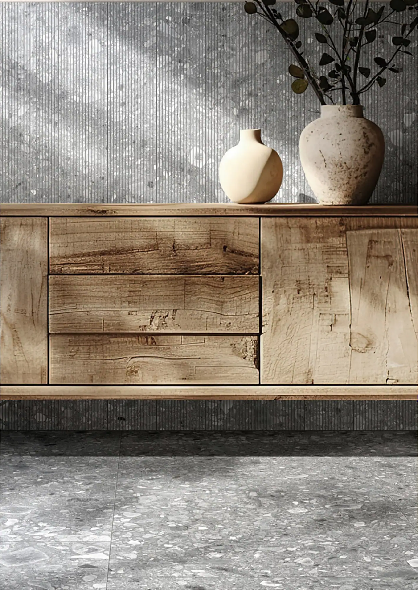
Ceppo Reale Scored: Terrazzo Meets Linear Texture
GIO’s Ceppo Reale collection is primarily known as a terrazzo-look porcelain — mineral fragments suspended in a sophisticated matrix, offered in four colorways (Bianco, Grigio, Beige, Anthracite) across 24 x 48, 24 x 24, and the format that matters here: a 5 x 48 scored listello.
That scored plank is a specification tool that doesn’t get enough attention. At 5 inches wide and 48 inches tall, it’s a narrow vertical format with precision-cut score lines that break the terrazzo surface into a linear, rhythmic pattern. Installed vertically, it creates a wall surface that reads as textured paneling with the material depth of Ceppo’s aggregate pattern showing through the scored geometry. The two layers of visual information — the linear score lines and the terrazzo pattern beneath — produce a surface that’s more complex than either element alone.
The practical story is strong. Ceppo Reale is a glazed porcelain stoneware rated for floor, wall, and countertop across residential, commercial, and industrial applications. At 9mm thick with 0.5% water absorption and frost resistance per ASTM C1026, the scored listello carries the same commercial performance as the collection’s flat field tile. A 0.42 DCOF means it’s rated beyond wall-only, though the scored format’s primary application is vertical.
Like Sarda, Ceppo Reale offers the pairing advantage: the scored 5 x 48 listello can be specified alongside the collection’s 24 x 48 and 24 x 24 flat field tile in the same colorway. A lobby wall in Grigio flat field with a scored Grigio listello accent band, or a column wrapped entirely in scored Anthracite — the material stays consistent while the texture shifts.

Sarda Decor: Sculpted Porcelain at Commercial Scale
SARDA’s Decor format is one of the most refined expressions of ruvido texture in the GIO catalog. The 24 x 48 wall tile features a sculpted ruvido finish — fine, closely spaced vertical striations that create a quiet architectural rhythm across the surface. The effect sits in the space between fluting and true sculptural relief: more complex than a simple groove pattern, but restrained enough to work on large continuous wall planes without visual fatigue.
Four colorways — Dark Grey, Stone Grey, Sand Beige, and Pearl Ivory — all sit within the warm-neutral range that’s leading commercial wall specification right now. The collection does double duty: it delivers genuine three-dimensional texture while staying within the earthy, grounded palette that hospitality and corporate interiors are reaching for this season.
What makes Sarda particularly useful for specifiers is the pairing system. The Decor tile shares its 24 x 48 format and colorways with Sarda’s flat matte field tile, giving designers a way to mix sculpted and smooth surfaces within a single material story. A feature wall in Pearl Ivory Decor flanked by flat Pearl Ivory field tile creates a textural shift without a color break — a detail that reads as intentional and architectural rather than decorative.
At 9mm thick with 0.05% water absorption, Sarda is rated for commercial and industrial wall applications. The V3 shade variation across the sculpted surface adds enough tonal movement to keep the texture alive at scale, so an eight-foot wall doesn’t flatten into monotony the way a V1 or V2 surface might.

3D Pietra: Natural Stone with Genuine Depth
For projects where the material story demands real stone, GIO’s 3D Pietra collection delivers linear, dimensional wall tiles in 14 colorways across slate, limestone, quartz, marble, and travertine. Available in a 6 x 24 format with three finish options — splitface, honed, and textured — it’s one of the broadest natural stone dimensional collections available for commercial specification.
The splitface finish is the most dramatic: cleaved stone faces with irregular relief that creates bold shadow lines under any light condition. The honed finish offers a smoother, more uniform surface with dimensional depth contained in the stone’s natural face variation rather than aggressive relief. The textured finish sits between the two — enough surface irregularity to cast meaningful shadows without the deep relief that makes splitface harder to maintain.
Having all three finishes available within the same collection and colorway opens a design move that’s difficult to pull off with sourced stone: transitioning from aggressive texture to smooth within a single material on a single wall. An entryway feature wall in Anthracite Slate splitface that softens to honed as it wraps into an adjacent corridor, for example — the stone stays the same, but the character shifts with the space.
As natural stone, 3D Pietra requires sealing for wet-adjacent installations and more attentive cleaning than a porcelain profile. For dry commercial feature walls — lobbies, reception areas, restaurant accent surfaces, retail displays — the material authenticity of real stone carries a visual authority that porcelain interpretations don’t fully match.
Choosing the Right Profile for the Application
Not every dimensional profile works everywhere, and the specification decision should be driven by three factors: the scale of the wall, the viewing distance, and the maintenance commitment.
Small-scale, close-range surfaces — vanity walls, reception desk fronts, elevator cabs, niche interiors — favor scored planks or fluted profiles. The detail reads at arm’s length, and the contained shadow lines don’t overwhelm a compact space. Ceppo Reale’s scored listello wrapping a reception desk front is a clean example.
Large feature walls viewed from across a room — hotel lobbies, restaurant feature walls, corporate reception areas, retail flagship surfaces — need more aggressive texture to register at distance. Ruvido porcelain or splitface stone carry the visual weight to hold a large wall. Sarda Decor’s sculpted surface or 3D Pietra’s splitface finish were designed for this application.
High-traffic, wet-adjacent surfaces — restroom walls, spa environments, pool house interiors — demand a porcelain profile that doesn’t require sealing and cleans easily. Sarda’s ruvido porcelain handles moisture and traffic without the maintenance overhead of natural stone.
Mixed installations — combining textured and flat tile within a single wall — are one of the most effective ways to use dimensional profiles. A band of ruvido texture at eye level with flat field tile above and below focuses the design energy where it matters most, controls cost, and creates a deliberate architectural moment rather than an all-over texture that can feel relentless.
Specifying Dimensional Tile: Practical Notes
A few specification details that don’t always make it into the inspiration phase:
Grout color matters more than usual. On a flat tile, grout lines are a grid. On a dimensional tile, grout lines interact with the shadow patterns of the relief. A high-contrast grout can break the visual rhythm of a scored or ruvido surface; matching the grout to the tile body keeps the texture continuous and lets the shadow do the work.
Substrate preparation is critical. Dimensional profiles amplify any irregularity in the wall behind them. A slight bow or bump in the substrate that would be invisible behind flat tile becomes a visible break in the shadow line of a fluted surface. Specify a true, plumb substrate and consider leveling compound on older walls.
Cutting requires a diamond wet saw. Dimensional profiles can’t be hand-snapped cleanly — the relief creates jagged edges. Specify diamond wet cutting in the installation notes to avoid field problems.
These are wall-only products. Dimensional profiles trap debris, are uncomfortable underfoot, and are not rated for floor load or wear. Specify them for walls and ensure the installation drawings don’t accidentally extend the textured tile onto a floor return or sill.
Making Walls Work Harder
The current generation of dimensional wall tile gives commercial specifiers something that was difficult to achieve even a few years ago: genuine architectural texture in formats and materials that install, clean, and perform within the demands of a commercial environment. Whether it’s the precise geometry of Ceppo Reale’s scored listello, the fine sculpted rhythm of Sarda’s ruvido finish, or the raw geological character of 3D Pietra’s splitface stone, the design tool is the same — physical depth that turns a flat surface into something worth looking at.
The key is matching the profile to the application, coordinating with the lighting plan, and specifying the practical details that keep the installation performing as well as it looks.
GIO’s dimensional wall tile collections are engineered for commercial performance. Connect with us to request samples, review spec sheets, or talk through your next feature wall project.