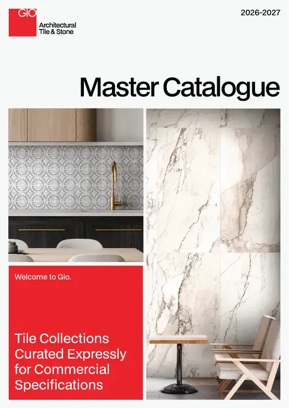

Color forecasting often reflects broader cultural shifts, and 2026’s embrace of warm ivory tones signals a desire for spaces that feel both refined and approachable. Unlike the stark whites that dominated previous years or the cool grays that defined the last decade, warm ivory occupies a middle ground—sophisticated without being austere, calming without being bland. For commercial designers, these creamy, confident neutrals offer a versatile foundation that supports both understated elegance and bold accent opportunities.
The Psychology of Warm Ivory
Warm ivory tones carry an inherent sense of comfort and stability. They reference natural materials—limestone, aged parchment, cream-colored wool—without feeling overtly rustic or casual. In commercial environments, this translates to spaces that feel welcoming yet professional, timeless yet current. Warm ivory creates a backdrop that allows other design elements to breathe while maintaining visual cohesion across different areas and functions.
These tones work particularly well in hospitality and workplace environments where creating a sense of calm sophistication is essential. Unlike pure white, which can feel clinical, or beige, which can read as dated, warm ivory strikes a balance that feels both fresh and enduring.
Material Expressions of Warm Ivory
The most compelling warm ivory palettes draw from natural stone inspirations, where subtle tonal variation and organic depth prevent the color from feeling flat or monotonous. Porcelain interpretations of these materials capture the sophistication of natural stone while offering the consistency and performance commercial projects require.
QUARZO by GIO exemplifies this approach, bringing a contemporary marble aesthetic to life through soft veining and delicate movement within a warm ivory palette. The collection offers designers a versatile foundation that works equally well in minimal and richly layered interiors, demonstrating how warm ivory can anchor diverse design approaches.

Terrazzo’s Warm Ivory Renaissance
Terrazzo continues its strong influence in commercial design, and 2026’s warm ivory trend has given this classic material a fresh perspective. CEPPO_REALE by GIO reinterprets traditional terrazzo through a refined lens, offering the authentic character and visual depth of Venetian terrazzo in porcelain form. The collection’s warm ivory base allows the subtle aggregate details to create movement and interest without overwhelming the space.
This interpretation demonstrates how warm ivory can elevate even the most energetic patterns, providing a sophisticated foundation that lets terrazzo’s inherent dynamism shine through in a controlled, elegant way.
Limestone’s Natural Authority
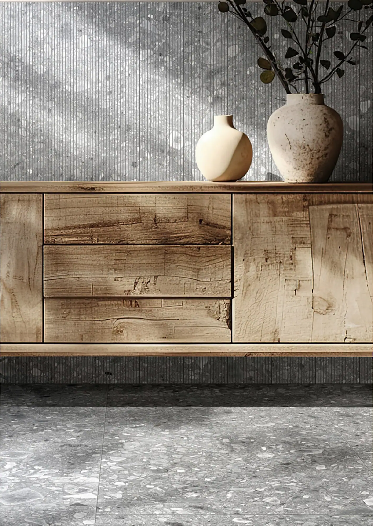
Limestone-inspired surfaces remain among the strongest expressions of warm ivory’s appeal. LUCE by GIO explores limestone through contemporary porcelain surfaces, offering large-format sizes and sculptural 3D striated decor that brings architectural interest while maintaining the material’s inherent warmth. The collection’s distinctive 3 x 18 chevron format adds movement and rhythm, showing how warm ivory tones can support both subtle and more expressive applications.
The limestone connection reinforces warm ivory’s natural authenticity—these aren’t colors imposed by trend forecasters but tones that emerge from materials with centuries of architectural history.

Marble’s Refined Warmth
Marble interpretations in warm ivory offer perhaps the most elevated expression of this trend. Breccia_Crema by GIO delivers a refined marble aesthetic shaped by warm whites, classic creams, and soft, varied veining. The combination creates a surface that feels both delicate and dynamic—an ideal choice for designers seeking to bring quiet sophistication and natural movement into commercial spaces.

BIANCO_CAMOUFLAGE by GIO takes a different approach, offering subtle pattern variation within warm ivory tones that creates visual interest without competing for attention. This kind of nuanced approach allows warm ivory to work in spaces where pattern and texture need to support rather than dominate the overall design narrative.

Global Inspirations
International stone traditions continue to influence warm ivory interpretations. TAJ by GIO draws inspiration from classic Indian stones, translating their warm, creamy character into porcelain surfaces suitable for contemporary commercial applications. This global perspective demonstrates how warm ivory tones transcend regional preferences, offering a universally appealing palette that works across cultural contexts.

Designing with Warm Ivory
The strength of warm ivory lies in its versatility. These tones work as a primary palette for spaces seeking understated elegance, or as a sophisticated backdrop that allows furniture, artwork, and accent colors to take center stage. In open-plan commercial environments, warm ivory provides continuity between different functional areas while maintaining visual interest through subtle tonal variation.
For designers working with limited natural light, warm ivory’s inherent luminosity helps brighten spaces without the harsh reflection of pure white. In areas with abundant daylight, these tones remain stable and appealing throughout the day as light conditions change.
The Enduring Appeal
Warm ivory’s rise reflects a broader desire for authentic, approachable sophistication in commercial design. Unlike trend-driven colors that may feel dated within a few years, warm ivory tones draw from natural materials with proven longevity. They offer designers a way to create spaces that feel both current and timeless—a valuable combination in commercial environments where design decisions need to perform well over time.
Every GIO commercial tile combines design-forward style with the durability commercial spaces demand. Our warm ivory collections provide the sophisticated foundation today’s commercial interiors require, backed by the performance specifications your projects need.